Week 4, Part 1: Aesthetics, Design, and Branding
Having a good website is one of the most important aspects of having a successful business. It is a way to introduce and engage your potential clients to your product, thus putting time and effort into it will make all the difference. For this assignment, the websites that were least appealing to me were https://jamilin.com, http://gatesnfences.com, and http://www.roverp6cars.com.
I chose these for a number of different reasons, but largely because of one word: clutter. Clutter is perhaps the biggest turn off when it comes to viewing a website. Yes, having a decent amount of information about your product/service is important, but there is an art to displaying it in an appealing way. I immediately felt overwhelmed when viewing these sites, especially http://gatesnfences.com. This could be improved by spreading the information across different pages, and not having all of it be displayed immediately on their home pages.
The second issue is the color and font choices. I really did not like the flashy, generic colors they used for their sites, and it made it even more overwhelming; there was no rhyme or reason to the colors they chose, and they did not go well together. To fix this, I would suggest a more thought-out color scheme for each site, something that could reflect the brand itself even, and be more pleasant to look at. I would also use more exciting font, because these websites are definitely dulled down with the fonts that they chose.
The third problem is the placement of the images on these sites. They are tossed around and pasted wherever. It seems that the website developers did not really grasp what they were doing, and just placed images anywhere they could fit them. There is no hierarchy to which images are more important, and my eye is drawn all around the page in a state of confusion. To fix this, I would put more thought into which images I wanted to show, and why.
Another issue I couldn't not mention, is the fact that each of these websites have grammatical errors and typos. This is incredibly off-putting for me as a customer; it makes it appear as though the company is lazy or does not care enough about its own product to proofread its website. To fix this, I would proofread, and pay close attention to the content that is posted.
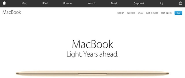
In contrast, the websites that were most appealing to me were of course, Apple and Toyota. I'll even tip my hat to the smaller https://www.headhunterhairstyling.com. I liked these websites because of their simplicity. You are not overwhelmed with information at first glance, and your brain has a chance to take in the product on it's own. Having tabs allows you to pick what you want to see, allowing you to take control of your experience and take in information at your own pace. The colors and photos used are very well selected, promoting the product in the right way and guiding your eye to the correct places. The sites are all easy to navigate as well, which makes them more pleasant overall.
All of these factors make for a great website, and therefor make you want to buy their product. By having a good website, with good aesthetics and thoughtful content, you are saying to your consumer: "I have my shit together, and I know what I'm selling you." People want to feel confidence when buying, and having a website that is unappealing, misspelled, cluttered or confusing will not instill that confidence.
I chose these for a number of different reasons, but largely because of one word: clutter. Clutter is perhaps the biggest turn off when it comes to viewing a website. Yes, having a decent amount of information about your product/service is important, but there is an art to displaying it in an appealing way. I immediately felt overwhelmed when viewing these sites, especially http://gatesnfences.com. This could be improved by spreading the information across different pages, and not having all of it be displayed immediately on their home pages.
The second issue is the color and font choices. I really did not like the flashy, generic colors they used for their sites, and it made it even more overwhelming; there was no rhyme or reason to the colors they chose, and they did not go well together. To fix this, I would suggest a more thought-out color scheme for each site, something that could reflect the brand itself even, and be more pleasant to look at. I would also use more exciting font, because these websites are definitely dulled down with the fonts that they chose.
The third problem is the placement of the images on these sites. They are tossed around and pasted wherever. It seems that the website developers did not really grasp what they were doing, and just placed images anywhere they could fit them. There is no hierarchy to which images are more important, and my eye is drawn all around the page in a state of confusion. To fix this, I would put more thought into which images I wanted to show, and why.
Another issue I couldn't not mention, is the fact that each of these websites have grammatical errors and typos. This is incredibly off-putting for me as a customer; it makes it appear as though the company is lazy or does not care enough about its own product to proofread its website. To fix this, I would proofread, and pay close attention to the content that is posted.
In contrast, the websites that were most appealing to me were of course, Apple and Toyota. I'll even tip my hat to the smaller https://www.headhunterhairstyling.com. I liked these websites because of their simplicity. You are not overwhelmed with information at first glance, and your brain has a chance to take in the product on it's own. Having tabs allows you to pick what you want to see, allowing you to take control of your experience and take in information at your own pace. The colors and photos used are very well selected, promoting the product in the right way and guiding your eye to the correct places. The sites are all easy to navigate as well, which makes them more pleasant overall.
All of these factors make for a great website, and therefor make you want to buy their product. By having a good website, with good aesthetics and thoughtful content, you are saying to your consumer: "I have my shit together, and I know what I'm selling you." People want to feel confidence when buying, and having a website that is unappealing, misspelled, cluttered or confusing will not instill that confidence.


Comments
Post a Comment